How to Add Dark mode toggle to your website
Add Dark mode toggle to your website in just 5 mins using Darkmode.js
Introduction
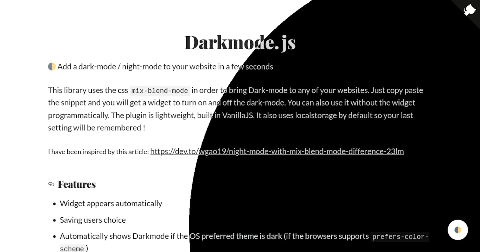
🌓 Add a dark-mode / night-mode to your website in a few seconds
This library uses the css mix-blend-mode in order to bring Dark-mode to any of your websites. Just copy paste the snippet and you will get a widget to turn on and off the dark-mode. You can also use it without the widget programmatically. The plugin is lightweight, built in VanillaJS. It also uses localstorage by default so your last setting will be remembered !
Features
- Widget appears automatically
- Saving users choice
- Automatically shows Darkmode if the OS preferred theme is dark (if the browsers supports prefers-color-scheme)
- Can be used programmatically without widget
📖 How to use
Darkmode.js is very easy to use, just copy paste the following code or use the npm package.
🚀 Easy way (using the JSDelivr CDN)
Just add this code to your html page:
<script src="https://cdn.jsdelivr.net/npm/darkmode-js@1.5.7/lib/darkmode-js.min.js"></script>
<script>
  function addDarkmodeWidget() {
    new Darkmode().showWidget();
  }
  window.addEventListener('load', addDarkmodeWidget);
</script>
📦 Using NPM
npm install darkmode-js
Then add the following javascript code:
import Darkmode from 'darkmode-js';

new Darkmode().showWidget();
⚙️ Options
Here are the option availables:
const options = {
  bottom: '64px', // default: '32px'
  right: 'unset', // default: '32px'
  left: '32px', // default: 'unset'
  time: '0.5s', // default: '0.3s'
  mixColor: '#fff', // default: '#fff'
  backgroundColor: '#fff',  // default: '#fff'
  buttonColorDark: '#100f2c',  // default: '#100f2c'
  buttonColorLight: '#fff', // default: '#fff'
  saveInCookies: false, // default: true,
  label: '🌓', // default: ''
  autoMatchOsTheme: true // default: true
}

const darkmode = new Darkmode(options);
darkmode.showWidget();
▶️ Methods
If you don't want to show the widget and enable/disable Darkmode programatically you can use the method toggle(). You can also check if the darkmode is activated with the method isActivated(). See them in action in the following example.
const darkmode =  new Darkmode();
darkmode.toggle();
console.log(darkmode.isActivated()) // will return true
Override style
- A CSS class darkmode--activated is added to the body tag when the darkmode is activated. You can take advantage of it to override the style and have a custom style
- Use the class darkmode-ignore where you don't want to apply darkmode
- You can also add this style: isolation: isolate; in your css, this will also ignore the darkmode.
- It is also possible to revert the dark-mode with this style mix-blend-mode: difference;
Example
.darkmode--activated p, .darkmode--activated li {
  color: #000;
}

.button {
  isolation: isolate;
}

.darkmode--activated .logo {
  mix-blend-mode: difference;
}
<span class="darkmode-ignore">😬<span>
Debug
If it does not work you may have to add the following code, but this will invalidate the classes to override.
.darkmode-layer, .darkmode-toggle {
  z-index: 500;
}
Browser compatibility
This library uses the CSS mix-blend-mode: difference; in order to provide the Dark Mode. It may not be compatible with all the browsers. Therefore the widget has been hidden in Internet Explorer and Edge. This library also uses prefers-color-scheme: dark to automatically enable the Dark Mode if the OS prefered theme is dark.
